08-22-2010, 01:00 PM
FWIW I just noticed a couple of things after looking at the original illustration:
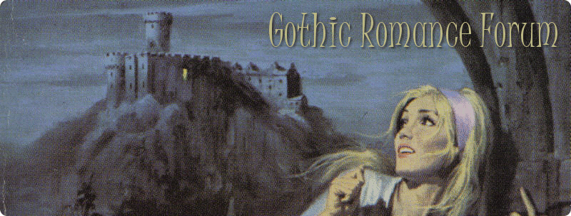
A good portion of the left side was cropped out of the cover, including the to be expected light in the window.
The signature is on the right side of her dress. It's clear in the original, but not so the cover.
A good portion of the left side was cropped out of the cover, including the to be expected light in the window.
The signature is on the right side of her dress. It's clear in the original, but not so the cover.


